Ir al contenido principal

color icons en mac

fuente : panic.com

Saving Icons for Snow Leopard

Obsessive designer? You may have noticed: icons made in Mac OS X 10.6 are often washed-out/lighter.
Normally we create .png files of each icon state, then drag them into Icon Composer. But, starting with 10.6, the colors would lighten unexpectedly. It wasn’t dramatic, but with certain icons (like the one below) it was totally noticeable. The source is on the left. See how the red is washed out in the final icon on the right?

We spent a long time trying to figure this out, and the story goes something like this:
Mac OS X is a fully managed color system. Colors aren’t just RGB, but also include a colorspace that maps RGB to an abstract color. When any bitmap is drawn to the screen, it’s color-converted. But there’s always been a loophole: an image can be “untagged”, meaning it has no embedded colorspace information. Mac OS X interprets untagged data in respect to the default colorspace of the display.
Well, in 10.6, that default display colorspace changed quite a lot to be more Windows-like and less old-school Mac-like, which makes untagged images look more or less the same cross-platforms. The bad news? There’s no way to tag an icon with a colorspace, so icons from 10.5 looked odd — way darker — on 10.6. Apple’s solution? Icons in 10.6 are interpreted in the “Generic RGB” colorspace, an approximation of how it was.
In other words, old icons would look too dark with the colorspace changes in 10.6, but the Generic RGB colorspace being applied lightens them back to exactly what they looked like before. Problem solved?
Not if you’re drawing new icons on a 10.6 system that’s already using the darker colorspace! Since those new icons go through the same Generic RGB colorspace converserion, they’re lighter than they should be!
Ok, ok. So here are the steps we use to guarantee 10.6 icon color accuracy.
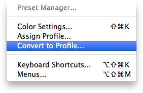
  1. With your final artwork open in Photoshop, choose Convert to Profile from the Edit menu.
  2. Choose Generic RGB Profile from the Profile pop-up.
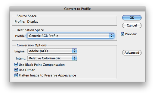
  3. Do a Save for Web… to make a fresh, Generic RGB .png of the icon. (Uncheck ‘Convert to sRGB’!)
    (Warning: the QuickLook preview of this .png will look too dark in the Finder. Ugh. Do not be alarmed.)
  4. Drag your color-corrected .png into Icon Composer, and save.
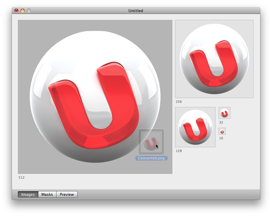
That’s it! Your final icon, once the system applies the Generic RGB profile, should look exactly as you intended. One possible downside: now your icon will look too dark on 10.5! Hooray!

Comentarios

Entradas populares de este blog

descargar mp3

como descargar musica necesario cuenta en grooveshark software : jdownloader Busca una cancion en : http://listen.grooveshark.com/#/ luego le clickas en compartir - widget (como se ve en la imagen) ahora lo han cambiado por - copy url - song url - y te dara el mp3. que se envia al portapapeles, en la memoria del ordenador Luego lo pegas en una web, o si tienes abierto el jdownloader ya podrás descargar la canción Luego en la ventana que sale le das al boton copiar URL (el boton que sale verde ), se copiara en el portapapeles de windows y si tenemos abierto el jdownloader se enviara para poderla descargar.

descargar de scribd

SOLUCION: Scribd.com es un intercambio de recursos muy popular de libros electrónicos. Scribd tiene la gran ventaja que no poseen otros sitios, es decir, la capacidad de mostrar el libro electrónico para leer en línea pero en los ultimos meses cambiaron la opcion de descarga de gratis atener que pagar pues con este truco lo podes descargar gartis. 1) Te debe aparecer el siguiente mensaje que te suscribas por un mes y otras basofias. 2) Ir a la dirección siguiente: http://www.scribd.com/mobile 3) Escriba el título del documento en la barra de búsqueda y pulse el botón de búsqueda (Search). Te recomiendo que cuando el título se repita demasiado; pues uses el nombre del documento seguido del autor como búsqueda. 4) Guarda el documento (Download Now); y a disfrutar Nota: En algunos casos la busqueda no da resultado para lo que buscamos hacemos lo siguiente 1.habres cualquierdocumentos http://www.scribd.com/mobile/documen...+Con+Photoshop http://www.scribd.com/mobile/...

harry potter tutorial

Fig. 1 Step 1: Set up the Photoshop file and add the text A) Install the Hocus Pocus font. B) Launch Adobe Photoshop™ and create a new file with the dimensions you'll need. In this example, our file is 2109 x 648 with a black background. C) Create a text layer and position the text in the center of the area: Font: " Hocus Pocus Titles " Text: "Hocus Pocus" Color: 787878 Anti-aliasing method: Sharp Kerning: adjust as needed D) To add a lightning bolt to any capital letter, highlight the letter and change the font style to "Hocus Pocus Titles Alternate." In Figure 1, the capital "P" was altered in this manner. Fig. 2 Step 2: Add dimension to the text In this step, you will apply a bevel to different text layers to add a dimensional lighting effect. This effect will create the illusion that the titling is being lit by an unknown light source near the center of the letters. A) Rasterize the text you create in Step 1 and rename the layer "Ti...